Thursday, 26 May 2016

Major Project: Editing Photos, Everything Coming Together

I had a little think about how i want everything to look for the degree show and ive come up with a little plan for my prints that are going on the wall, i basically want to showcase my favourtite images, some of which arent featured in the magazine as a kind of overview of the project.
This is a little mock up of how my prints will look on the wall, probably straightened up a bit, the bigger images will be A1 size and the smaller three A2
Ive editied my images with a little guidance from some inspiration images. I had the option to edit them as RAW files or Jpegs, RAW files gives you a bit more options but they can be really fuzzy and too sharp looking if you dont play about with them so settled with good old Jpeg. I decided my Selkie images were going to be romantic and dreamy with the exposure turned up and a bit of a warm photo filter on to make it look a little bit like a vintage photo. I was considering making my bridge image black and white so it resembled one of Cindy Shermans film stills but i really like the colour of the bridge so ive kept it in colour.


The Drosten images were going to be really bright and have the colour saturation turned right up. I also used colour selection which allows you to enhance specific colours in an image, i used this mostly for brightening the blues in the sky and i did a little on my blue face paint to deepen it up.


The Agnes images were darkened up and some had a bit of a vignette added. This time i used a cool photo filter which made them look a bit spooky and cold. The red of my dress was too bright and i wanted it deepened a bit so used a little bit of colour selection (too much made the material look weird) and played around with saturation.


Thursday, 19 May 2016

Major Project: Final Photoshoots

Ive now pretty much finished taking my photos for my final display and magazine, just got one more water based one to do. Had a little bit of trouble with these shoots being in quite public places with me all dressed up it was hard not to feel a bit exposed. We took some images for my characters Drosten in the local park, i originally wanted to take photos around the skatepark but it was busy even at half 10 in the morning, we did however get pictures at a graffitied crate next to it. This 'real' graffiti is a nice contrast to the murals of Glasgow which we shot on the Sunday which was pretty quiet for Glasgow. I decided to go for the panda (very Scottish) and the animal mural by Rogue One down closer to the river.


Close up taken in Kings Park showing off my fancy Scottish nail art, i wanted to get as many cultural references as i could like the referendum, tartan, food and drink and patriotism.

Had a bit of a wig and makeup change for this image taken on the tennis court, bit of a nod to Andy Murray, i went for this Braveheart style blue woad look and featured my Starbucks cup redesigned for people who are after that Scotland look
Panda mural on Gordon Lane just off of Buchanan Street by Klingatron
Mural by Rogue One and Art Pistol, im using a landscape photo of this for my magazine so you get the full scale of it.
I also got a mini shoot done for my Agnes character based on the execution of Mary Queen of Scotsand ive still got to get some pictures of myself in water mermaid style up at the dam. Next job is selecting the photos for my magazine and large prints and editing all the photos.

Thursday, 5 May 2016

Major Project: First Few Images (unedited of course)

Ive started taking my photos now, about a week later than i had originally planned to at the start of my project but not feeling too stressed about it. Getting all my images should take about three weeks, but ive got a good chunk out the way so far from Alva Glen and what i thought was Dumyat hill but is actually the Witches Craig which is much better, taken on the 23rd and 24th of April. I got more photos done at South Queensferry on the first of May, weather wasnt great but thats Scotland for you and due to tide times there was one place on the beach i wanted to shoot but couldnt get to. My boyfriend John is my acting photographer and driver for these shoots so props to him.

These images are going to have a soft romantic look to then as Selkie longs to get back to the water

Trouble in paradise Selkie as the battered woman, i made sure that she looked extra beautiful in these close ups, bruise makeup done with mehron bruise wheel

Agnes being spooky on the Ochil Hills, i really liked this knotted tree with all the sheeps wool hanging from it, darkened up these images will look really atmospheric a call to the witches who danced on the hills
Drosten also on the hills, i wanted a bit of texture and pattern clash to look quite high fashion and a bit punk, the idea of hanging out on the hills is like the hipsters hanging about gentrified urban areas drinking their cheap beer and expensive coffee
Drostens blazing red hair and fake freckles are another bit of appropriation and Scottish stereotyping, i also wanted to get the blues and oranges of the Irn-Bru branding in there
I actually really like the way the 60s vibe of my outfit makes this image look a bit like one of Cindy Shermans film stills, i think some of these images might look good in black and white

I also want to add if anyone was wondering, im not going to be editing out my tattoos or anything like that, part of my work is that i am my own model and its always me you see in the characters. the point wasnt that you would never know that i was any of these women but rather that i am all of these women and i wouldnt change my features to be unrecognisable at least not in this project.

Major Project: Meet the Weird Sisters

I have my three characters fully fleshed out now. I decided to name the three 'The Weird Sisters' in honour of the witches in MacBeth.

singer Lana Del Rey and Marilyn Monroe, inspiration for 'Selkie'

My first of the sisters is Selkie, shes going to be the figurehead for the glamourisation of violence against women in fashion photography. Partly based on the myth of the Selkie bride i want her images to tell the story of a wild creature who ends up trapped by the man who professed to love her and becomes violent. Ive decided to reference iconic blondes for her look, classic tragic beauties from the golden age of cinema. These images should be dreamy and my Selkie should look beautiful and melancholic, im going to be taking photos near and around water as she longs for the freedom of the sea. I might also reference the iconic Ophelia, a symbol for the tragic beauty.

Rachel Maclean (left) Cultural appropriation and Scottish stereotypes for sister two

The second sister is Drosten, named after the pictish Drosten Stone (but i also liked how it sounded like Doutzen Kroes). This sister makes reference to Scottish culture both historical and modern, I want to have pictish blue woad paint and symbols to have a nod to the lost culture of the picts and also have some modern stereotypes and cliches about Scottishness. Drosten is the embodiment of cultural appropriation in fashion, of course im using an exaggerated version of my own culture to represent this. The idea is: what if hipsters suddenly became obsessed with Scottish culture? What if the ideas of slumming it wasnt drinking pabst blue ribbon beer in Williamsberg but drinking Buckfast and Tenents out in Glasgow? What stereotypes and ironic cliches would be appropriated by outsiders?

Dark and gothic high fashion photography and Scotlands bloody history represent the third sister

My final sister is Agnes, whose name comes from the legendary Black Agnes the Countess of Dunbar. Women are often missing from Scottish history, relegated to figures of tragedy. Since im going for a bit of Gothic romance i will make reference to these tragic figures, like Mary Queen of Scots at the time of her execution. Ive also become quite interested in the tales of witches around the Ochil Hills where they danced with the Devil around Witches Craig, which is just up the road from the college. Agnes is darkly romantic and witchy, i want her images to reference Scotland's bloody history, witchcraft and mystery and how this dark romance gets used in fashion photography by stylists courting controversy with Illuminati imagery or just being very over the top with their symbolism of duality.

Thursday, 28 April 2016

Major Project: The Illuminati

My third and final fashion photography trope is going to be the weird pop culture phenomenon that is illuminati symbolism. Honestly if you look into a bit you might be forgiven for thinking that any symbols or gestures used by a pop star or a fashion label could be construed as 'illuminati confirmed' but im going to be focusing on fashion photographers who constantly make reference to these motifs and get the conspiracy blogs buzzing.


Nicola Formichetti, who gained notoriety after being stylist to Lady Gaga often does this over the top gothic bondage thing, he is currently the artistic director for fashion brand Diesel. Ive seen his styling work before, being a fan of Brooke Candy and saw him pop up again on an illuminati conspiracy blog discussing Brooke's 'A Study in Duality' music video. The blog which can be read here talked about his work with Lady Gaga (also full of illuminati symbolism) and breaks down the symbols in a Study in Duality. So what symbolism is this?
Image of Brooke Candy from A Study in Duality

Firstly theres the monarch butterfly, this represents monarch programming, part of the CIA's mind control program MK-ULTRA, monarch programming is named after the butterfly because of the whole emerging from the cocoon reborn thing.

Nicola Formachetti with the monarch butterfly covering one eye, very illuminati

Another prominent fashion figure from the illuminati blogs is photographer Steven Klein. Like Nicola he has this dark, fetishistic aesthetic using imagery of duality and playing up the sexuality of his models. He has shot campaigns for Alexander McQueen, known for their use of the skull motif, another illuminati symbol. His work also has a bit of a violent edge which i suppose could be interpreted as a display of the models sexual agency but can come across as objectifying.

Steven Klein for Alexander McQueen

Kate Moss for W magazine by Steven Klein

So do these fashion people know what they are doing by making reference to these satanic symbols? Or is it just really easy to be branded as part of the NWO every time you put a woman in bondage gear and try to symbolise the different aspects of her characters personality? Who doesnt reference death and sex in their artwork and as we've seen before courting controversy in the fashion industry isnt a new idea.

Since im doing a character that is very witchy and dark and looks at Scotlands more bloody side i want to use some of this overplayed 2spooky4u imagery as part of my images.

Tuesday, 12 April 2016

Major Project: Locations 2

My second round of locations involved looking for places with water and going to Glasgow. Im not sure Glasgow was quite as fruitful as i thought it would be, i dont really know Glasgow that well and we had to find somewhere that would be close to Queen Street station to travel to. In Glasgow there is a bunch of really nice artsy murals, really bright and colourful but i had my heart set on something a bit grittier, a mish mash of graffiti with little artistic merit and a few swear words. But these murals might work, if im looking at cultural appropriation and gentrification then having this council sanctioned graffiti might be a better representation of those ideas than an area that has been tagged by teenagers in the dead of night. Esentially im not sure if these murals only really say Glasgow to people who know Glasgow well, they could be from any major city in the UK.

On the Sunday after going to Glasgow we went off to South Queensferry which was just a bit different, to get photos on the beach around the forth rail bridge. I got a bunch of better shots here for my Selkie character. I really like the iconic bridge in the background and think it will make some really grand and epic looking shots.

Panda just off Buchanan street

Animal Mural down by one of my favourite places to eat by Rogue One

colourful toucan thats part of the mural above


Thursday, 7 April 2016

Major Project: Scouting Locations 1

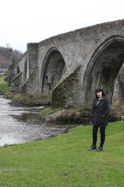
 This is a little bit later than i had planned to do it due to illness and weather but im finally getting round to looking at possible locations for my photographs. This weekend started with the Alva Glen, Dumyat Hill and Stirling Bridge. Ive got a few ideas so far on what spots i want to use for what but i still have to storyboard everything so i have a solid idea of what image gets taken where.

This little ledge at Dumyat shows both the landscape and industry of Scotland, it also has really pretty coloured moss on the stones that could be brought out in editing
Ive been looking for places with water for my Selkie character, this is a man made waterway that could show her out of her element

There were a couple of these gnarled trees at Dumayat, they remind me of one of the images from the Sairose Ronan Vogue shoot and could be really atmospheric
This little bridge was very cute, i was thinking how fun it would be to have really killer heels surrounded by all this mud

Another of the trees, this one was a bit bigger and had more room inside its branches

I like this layout standing on this old wall with the hills in the background
Stirling bridge is another possible location because of its history and the good views you can get underneath it, this could be really dark and moody

Going into next weekend im going to be looking around Glasgow for my urban locations, i want places with graffiti and alleys. Im also going to be looking at more places around water, going down to South Queensferry to get a location near the rail bridge.

Tuesday, 5 April 2016

Major Project: Cultural Appropriation and the Fashion Industry

African themed editorial in Vogue Italia
 
 The second fashion photography trope i am looking at is cultural appropriation, the act of a dominant culture using aspects of another culture which usually perpetuate and reinforce stereotypes about that culture. This is a good article about the problems with cultural appropriation on Everyday Feminism.

When it comes to fashion photography magazines often reference African cultures under the umbrella term of 'tribal'. Vogue magazine has come under fire for editorials that show white models in face paint and graphic prints posing with African animals and Vogue Netherlands has been in trouble twice for using blackface, painting a white models skin darker for an editorial called 'African Queen'. This has trickled down into everyday fashion with bindis and henna being worn as fashion accessories and native American war bonnets being worn by hipsters at music festivals.

Picture-1002
White model Lara Stone in French Vogue

Pharrell Williams in a war bonnet for Elle UK, Williams later apologized


Im looking at cultural appropriation because it ties into the idea of Scottish history being written by those who came across the ancient Scots, The Picts way of life being lost as they adopted the traditions of the Gaels and the way people view Scotland today. It reminds me of this quote by Alexander McQueen:

'Scotland for me is a harsh, cold and bitter place. It was even worse when my great, great grandfather used to live there. The reason I’m patriotic about Scotland is because I think it’s been dealt a really hard hand. It’s marketed the world over as . . . haggis . . . bagpipes. But no one ever puts anything back into it.'

Image from Rachel Maclean's I Heart Scotland, looking at stereotypes of Scotland in a fun, tongue in cheek way

My idea is to create a series of fashion images exploring the idea of Scotland and Scottish culture being popular with hipsters, how it would be boiled down to its most basic stereotypes and fashion items being used to represent an entire group of people. As annoying as the tartan, haggis and bagpipes stereotypes are i dont think they have quite the negative impact as blackface and acting like you can represent an entire continent with a 'look'. But i think using Scotland i can really over the top and discuss cultural appropriation (and at times blatant racism) in fashion editorials without having to use African countries or any 'exotic' eastern cultures as a prop. After all, another problem people have with hipsters and the fashion industry is their appropriation of the working class and obsession with poverty. There is an article about why the appropriation of working class culture is a bad thing here on Complex and why it isnt a bad thing here on Hypebeast. Poverty is a problem in Scotland and i want these images to represent that as well as the way the fashion industry is infatuated with glamourising that and misrepresenting cultures in the same way they miss the mark with domestic violence.

Wednesday, 23 March 2016

Major Project: Documenting Domestic Abuse


One of the most famous images of domestic abuse, self portrait by Nan Goldin


Ive been looking at the way violence against women is glamourised in advertising but what about photographers who have documented actual cases of abuse and its victims. I didnt really know much about this except someone else in my class did their contextual project on the different ways male and female photographers use these themes in their work and its through her i found Sara Naomi Lewkowicz.Lukowicz's project Shane and Maggie documented the abusive relationship of 19 year old Maggie, her boyfriend Shane.This project was originally focused on Shanes life as an ex-convict but she began documenting the abuse Maggie was suffering at Shanes hand. Lukowicz has had a lot of criticism towards this project, being blamed for allowing the abuse to happen and not intervening but she has also won an award for her documentation for domestic violence. You can read an article by Sara documenting Maggies journey after leaving Shane here.


Image by Sara Naomi Lewkowicz

This article also mentions Donna Ferrato who has documented domestic violence for over 30 years after witnessing and documenting the physical abuse in a polyamourous couple she was sent to photograph by Playboy magazine in the 80s. She has created the series I Am Unbeatable focusing on women who have left their abusers.

Image from Donna Ferrato's I Am Unbeatable project

The way these female photographers document domestic violence is in stark contrast the the way the mostly male (at least from what ive seen) photographers use domestic violence as an edgy theme to advertise clothes in glossy magazines. I want to look at the theme of domestic abuse and violence against women not because theres a problem with its representation in the magazines bought primarily by women but because its a very real problem in a lot of womens lives. Its a reality in Scottish womens lives and i want to show this through my work. Domestic abuse is the fourth most common cause of homelessness in Scotland and research by Scottish Womens Aid found that women leaving abusive homes were being let down by local councils and housing providers. Ive been doing some research through Rape Crisis Scotland's This is Not an Invitation to Rape Me.co.uk, according to them a survey done in Scotland in 2008 found that 27% of people thought a woman could be blamed for being raped if she was wearing revealing clothing, i'd hope that number would be lower now but who fucking knows.

 Ive been wondering if people see my images of a glamorous woman with a fake bruise and torn clothes they wont get the point im trying to make about shitty depictions of abuse in fashion media, but im not sure it really matters. If someone sees the image and they get pissed off that someone would be so callous as to show an abused woman like theres something beautiful and aspirational about that, well they should be.


Sunday, 20 March 2016

Major Project: Fashion Photography and Violence Against Women

'If we finally got rid of the idea that fashion if for victims, maybe we'd see fewer victimized women in fashion magazines.' -Jenna Sauers.


One weird thing i wanted to look at in the realm of fashion photography was the image of the battered woman frequently used in editorial shoots in popular high fashion magazines. These images have appeared since the 70s in editorials in magazines or as part of a fashion brands advertising showing female models as glamourised victims of physical abuse. In the 1980s there was a trend to show women in fashion ads bound and gagged or appear beaten. The image of the beautiful female corpse has been part of advertising imagery for decades still appearing today, theres a good article on the Guardian about this trend by Kira Cochrane here.

Over the years female corpses, especially beautiful female corpses, have become a staple of fashion shoots, advertising campaigns and TV shows – with sexual and fatal violence against women a favourite of TV programmes looking to boost a waning audience or build a new one. -Kira Cochrane.


Dolce & Gabbana advert described by some as a 'rape ad'

The fashion industry has gotten a lots of criticism for this glamourisation of violence against women and the fetishisation of its victims but with these images appearing in some of the biggest magazines and being used by the biggest brands like Calvin Klein and Dolce & Gabanna its almost like no one actually gives a shit, whether thats the advertisers or audience. Or maybe this kind of Shockvertising is a cynical ploy for attention, to be seen as edgy, to show that the world of high fashion goes beyond the realms of boring old good taste.

'The Wrong Turn' by photographer Raj Shetye based on the gang rape of a woman on a bus in New-Dehli

The thing is that in a world where violence against women in a very real threat the idea of having these images in magazines and advertising aimed at women doesnt seem very edgy or alternative at all rather just reinforcing the idea of sexualised violence being a constant and normal part of being female. The image of the beautiful battered woman has become so commonplace now that you cant even call it shocking or controversial, its more cliched than anything in my opinion.

Part of a beauty spread by 12 Magazine showing the faces of models bruised, cut and burned with acid

One of the reasons i wanted to research this as part of my major project is because this imagery, this objectification and sexualisation of beaten women is so common in fashion advertising. Fashion imagery can be beautiful and fantastical but it can also be basically exploitative and awful, completely separated from reality in a bad way. Domestic violence is a real world problem, its a problem in my home country. The idea that people want to create images of battered women in order to create a beautiful fantasy is just completely awful. I want some of my images to highlight the reality of being a woman in Scotland today, dealing with our problems around domestic abuse and sexual assault. I can either use these images as a reference point to not glamourise my photos, or be so over the top and awful and hold a mirror up to this trope.


Read more about fashion photography and violence against women on Jezebel here, and more about the New-Dehli bus rape fashion shoot on Time.com
More examples of images on Buzzfeed

Tuesday, 8 March 2016

Major Project: Trip To Aviemore and Creating Characters

This past week i took a trip up to Aviemore for a little holiday and inspiration from my surroundings. Had some nice walks and got some nice pictures around the lochs, have to say that when it comes to creating my final images its a bit of a trek to go that far up north so right now just using the colours and textures to draw inspiration from.


I also had a bit of down time and watched the new Macbeth film (not because im too lazy to read it). It managed to get the cold bluey atmosphere of Scotland down right, i also really liked some of the costume and makeup design with not only Macbeths facepaint but Lady Macbeth and the other women having these light blue stripes across their eyes.

Michael Fassbender as Macbeth (2015)

Ive had a bit more of a think about the characters i want to create and i think im getting somewhere with three characters based around Scotlands bloody history, what people think Scotland is and Scottish stereotypes and the harsh reality of being a woman in Scotland today. I think im going to use a combination of rural and urban landscape mixing those two sides of what Scotland is.

On my trip up to Aviemore i just by chance bought the latest copy of Love Magazine. Its a really artsy British visual fashion mag that has these big editorial fashion stories one of which was based on Heironymous Bosh's The Garden of Earthly Delights by Tim Walker. So im considering maybe making a magazine type thing to display several images. Something ive noticed is that this magazine seems to have less sexualisation of the naked female body or depictions of women as victims as the big name mags like Vogue.

   
Tim Walker for Love Mgazine S/S16

Ive also been told to think about creating some kind of video or moving image to go with my photos, I would like to do this but it depends on how much extra work its going to be overall. Ive had a look at SHOWstudio which is like the home of fashion film.

In this coming week i want to have my three characters fleshed out a bit, to be thinking about exactly how i want my photos to look and the feel of them in order to create a connection with my audience and maybe get out Scouting locations at the weekend.