Showing posts with label first year. Show all posts

Thursday, 28 August 2014

The Journey

This is a bit of a master post all about my favourite piece of work from first year, because im not a very good blogger and theres no point chopping it up into several posts now.

So this brief was to make a book based on the theme of 'The Journey' i had been looking at Molly Soda a lot and wanted to focus on that sort of girls in their bedroom idea. My theme was the journey from childhood to adulthood focusing on teenage years, i started by focusing on my teenage years which is actually a bit embarrassing to think about but it led me to another jump off point which were a set of tarot cards because i used to be into that stuff when i was younger.

The main focus of my book was to use the tarot card archetypes and turn them into teenage girls in their bedroom, inspired by Cindy Sherman and Alis Pelleschi.I focused on doing 13 of these portraits partly because of the amount of time it actually took to stage and take the photos but also because 13 is the age where you actually become a teenager and its also considered unlucky, but maybe thats just a coincidence.

Alis Pelleschi 'Super Fans'

Another artist that provided a lot of inspiration for this project was Rania Matar, a photographer who made a series of portraits of teenage girls in their bedrooms. Her work focuses mostly on women and girls, the spaces they occupy and the relationships they have with each other. I found her work really interesting and i really liked the visuals of girls in their rooms, their personality reflected in the mess and the things they chose to display on the walls.

Brianna by Rania Matar

 I started researching tarot cards, looking at the major arcana which is like the Death card and the Sun and Moon. I made a list of all 22 cards and things that could represent these cards or things that linked to my own experience.

With some of the the cards i wanted the image to link with the original meaning of the tarot, like the Fool, which is card Zero, can represent innocence or foolishness and sometimes the major arcana is seen as his journey through life. I wanted my fool to be a girl at the start of her journey into adolescence, surrounded by things from her childhood, packing her bag for this figurative trip. Death was more about the image of the skeletal figure, i was thinking about an emaciated girl obsessed by her weight becoming this deathly figure.


Once I had all my images made i started to think about way of editing them, i didn't really have any access to photoshop or anything so i had to think of a different way of getting a visually interesting set of photos. I decided to try out some collage stuff, printing out the photos in black and white and covering select parts in glitter or paint. I think worked amazingly well on some of the photos, making them much more surrealist looking.

Death card black and white version

The Temperance card was really improved by the glitter falling from the bottles and the misty background


I created a colour version of the zine and a black and white version with only the gold and silver glitter in colour. I have to say the glitter version was my favourite even though it took a lot of my time to scan in all the little collages i had made with the photos as well as having glitter everywhere in my house for about a fortnight. The photos themselves also took a really long time to do and im glad it was only 13 because theres no way i would have time for 22. All in all i really liked this project and really like what i made despite stressing about time and computer stuff.

Monday, 26 May 2014

Drawing the college

The first brief we were given for drawing was to go around the college drawing places with negative space and lots of straight lines, first in our sketchbooks, i did these using charcoal and black conte pencil.

I then used these drawings to create A1 drawings in chalk and charcoal.


I found all the straight lines tough going, ive never really done anything like this before on the large scale, i think my drawings on black paper turned out really well though.

Sunday, 25 May 2014

Specialist Skills: Collagraph

Collagraph is another printmaking technique and one that ive tried before one time. This technique involves creating a textured collage which is varnished and inked to be printed. This collage plate cant be too textured because you wont see all the detail and it can break through the paper.


To print the collagraph you need to use a registration board, this is a numbered board you place the inked plate in and then the paper on top, the edge on the bottom left keeps your paper straight and always in line with the plate if you want to layer your prints. The registration board is placed between two wooden boards with padding and put into the book press to transfer, i used newsprint and sugar paper for these prints.


This collagraph was created with tissue paper, i printed it in black ink, white ink on black sugar paper and a red and green gradient which was quite difficult as i had to mix my own green.


Celebrate the Ballpoint Pen

Now being in the second half of the year we have a new class, Pathways Project. To start this off we were given a mini brief to investigate the possible pathways we might choose for years 2 and 3, this mini brief is 'Celebrate the Ballpoint Pen'.

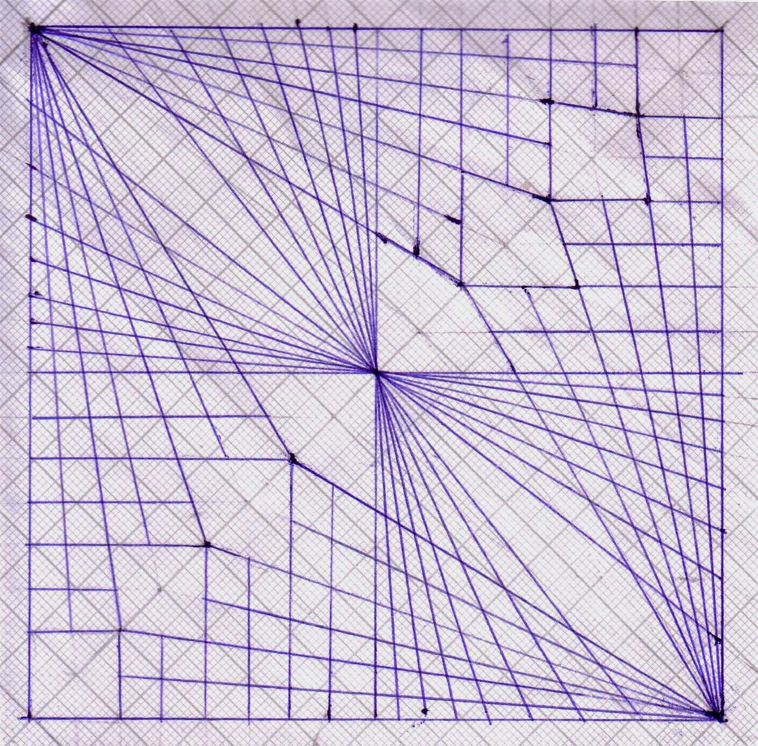
I started off with Applied Design Crafts inspired by a book i found in the library about teapots. I wanted to create a modern willow pattern teaset, thats the Chinese blue and white pattern. I had already looked at one artist Richard Sarson whose work i really liked and inspired by his work on graph paper i created these tiles using a blue biro and steel ruler and lots of concentration.


I scanned these tiles and turned them into patterns in photoshop


Specialist Skills: Monotype

Monotype is a super easy printmaking technique, which allows you to draw directly in ink or trace an image as long as you use fairly thin paper.

The key is to roll out a really thin layer of ink to place your paper on top of, having too thick a layer can lead to patches of ink transferring onto the paper like the print below


These prints were made by creating a gradient of light blue and red ink and drawing directly onto newsprint and tissue paper. I managed to get the ink pretty thin and avoid placing my hand on the paper making the ink transfer.


I wanted to create prints similar to Eveline Koljin's work. She looks at patterns in nature and created a series of intaglio prints based on images of bacteria and cells coming together in symbiosis.


Image by Eveline Koljin from her website

Wednesday, 21 May 2014

Specialist Skills: Plaster

Ive never worked with plaster before or done much sculpture but ive really enjoyed working this workshop. First off was using the vacuum former to create a mould to be poured. I was still struggling a bit with my theme for transformation so i took inspiration from a picture of the moon i got online. Using nuts and washers i created a mould on a block of wood and poured the plaster into it. When it dried i used a dry brushing technique to paint it.


I used a bit of sandpaper as the 'moon' and washers and nuts found the workshop cupboard as craters, on top of it all i put some plastic netting stuff which helped me get all the washers and bits out of the mould and created all the liney texture.


You might be able to see that part of the mould broke off where one of the larger nuts was


The dry mould was painted with black acrylic then when that was dry it was gently brushed with a tiny bit of white acrylic on a dry paintbrush.


Continuing with plaster was a bit of plaster carving, first of all i had to come up with a design so that i could create a clay wall to be poured. I decided to look at virus microbes for inspiration and create a sculpture based on the cold virus.


I started off with a clay wall to pour my plaster into, when dry this would then be carved into with chisels and grating tools like the yellow handled one.


This was actually really hard going and took longer than i thought, it was difficult to create the smaller spheres and keep them intact while i carved out the larger spheres the plaster was also getting drier as the days went on so carving was a bit more difficult.

Specialist Skills: Glass

Glass fuse was pretty easy but can take quite a bit of time to do. To fuse glass you just have to carefully cut and layer your glass to be baked in the kiln. Glass can be full fused or tack fused which doesnt fully melt the glass and can leave you with a textured effect.


This glass wasnt originally supposed to be orange but the colour changed in the kiln, i think it actually looks pretty good against the blue.


You cant see it properly in the photo but i used lots of pearlised  glass


This piece was made using glass crystals and powder and put in the kiln on a tack fuse, it really reminded me of the petri dishes ive been looking at and i was inspired to try and make a petri dish looking piece


I tried my best to cut a smoothe circle of glass and used the thin shards and crystals to get the petri dish look. I though the edges might smooth out in the kiln but not really, i still think the effect worked well the little crystals look like paint splatters.


Fruit part 3

The third part of the fruit brief was to use the knowledge you've gained researching fruit to design your own brand new made up fruit. I decided to go with poisonous fruit using habitat as a starting point, I wanted to think about a fruit that could grow in or near polluted oceans.


I also looked at genetically modified fish and bioluminescense, plants and jellyfish and squid that glow underwater due to the bacteria in the water they eat, I was thinking about the way pollution in the water could effect the fruit.


I also looked at shells for inspiration for the shape of the fruit


I also looked at poisonous frogs, the way they they ward off predators with their bright colours.


Keeping on the poison theme i looked at sea urchins and anenomes, which are also bright and have really lovely structural forms. My final design is on the very left, a combination of the sea urchin spikes and bobtail squid spotted pattern.

Specialist Skills: Paper Folding

The Specialist Skills class is all about learning new practical skills and using them to explore the theme of 'Transformation'. Im not quite sure about my theme so far but we've started with our workshops the first being paper folding.

Life Drawing

This is a selection of life drawing ive done this year, I felt like it took me a little bit to get back into it, i enjoy life drawing but i feel like if im not having a great class its hard to turn it around and produce work you feel good about. Despite this i feel good about a lot of the drawings ive done here.


 This is a page of quick sketches of a moving model

 Getting better at my proportions and feeling comfortable using charcoal.


I think this last piece is the best ive done so far.

Fruit part 2

Following on from fruit research was investigating fruit firsthand by sourcing fruit to draw. It was slim pickings in Tesco at first but i managed to get a good enough selection of stuff my favourites being the physalis which didnt taste that great and the humble orange which is good to draw and eat.


I drew these figs using watercolour pencils and a bit of ink, from the outside the fig isn't very spectacular but inside is complicated and fleshy and full of little seeds.


I really like drawing physalis, the sculptural shape is a lot more interesting than most fruit from the outside


This is a monoprint of a pomegranate quarter, i think it turned out really well but because it took so long to get all the detail in the ink started drying halfway through and i had to hurry it up a bit.