Tuesday, 20 October 2015

Non-Place: Childhood Nostalgia

Looking into smell and nostalgia i found this article about the science behind  it all. Apparently research done in Sweden found that when exposed to certain smells people could recall memories from younger ages than people who just heard the names of the smells and people who had the smell along with its name recalled more memories.
Im using this information to create my own blend of essential oil scents along with information from Snoezelen about how aromatherapy oils are used to relax or destress. I want my scent to recall memories for people but if you've ever walked past a candle shop near Christmas you'll know it can go a bit far with the old artificial mulled wine and winter fruits.

Going overboard with the Christmas factor is something i also have to think about with my images. Seeing as i always put myself in my work somewhere i have decided to create a projection which uses photographs from my own childhood mixed together in a kaleidoscope. Its my hope that people will be able to pick out some elements of the photos, some snow or a christmas present (or a beach holidayin the Summer), without seeing the full picture. To recall memories of good times and childhood happiness without plastering a picture of my gurning baby face on a wall.

(my photos)

While i was looking into kaleidoscope style artwork i found someone else turning old photos into patterns. Nicole Crock's Tesselate project turns vintage photographs of people and their homes found in thrift stores into abstract patterns which she also makes into three-dimensional origami shapes, since im looking a bit into 3D mapping, origami stars could be the way to go.


looking at these made me think about using not only photos from my childhood but family photos of holidays and good times going way back before i was born

images from nicolecrock.com

Non-Place: Brian Eno Made Me Do It

After doing some more Snoezelen research i found that the rooms contained projectors showing images on the walls, maybe a forest combined with the sounds of trees. Im now thinking about doing a projection, something ive never done before which is a bit scary.

Brian Eno (yes that Brian Eno) does a lot of projection work and his installation 77million paintings has been projected in Rio de Janeiro, Madrid and even on the Sydney Opera House. I found this really intersting snippet on his website:

Working on evidence that the use of art and music can produce improved psychological, physiological and biological outcomes of clinical significance in patient care, Eno created an eight-piece version of 77 Million Paintings.
On the lower-ground floor, he created a Quiet Room where patients and staff can sit and be immersed in shifting colours and soundscape. As one journalist soberly commented "so you have to be pretty ill to hear this particular piece of music."
Architects IBI Nightingale said: "Creating a healing environment isn’t only about correct surgical procedures and the right technology but also about making an atmosphere where the patients feel able to relax enough to clearly think through their options, and to properly take part in the healing process themselves."
Now other hospitals in England have commissioned Eno to create similar rooms for their spaces and schools are now approaching Eno for quiet areas for their pupils.

 This is exactly the sort of thing i want to do so im glad i looked at his site. Ive done a wee bit of research into other installations and artwork that uses projection, from simple light creating shadows to the complicated but impressive 3D mapping.

Jenny Holzer, projection in San Diego 2007

Interactive sound installation 'Noisy Skeleton' by Theoriz
video projection onto origami by Joanie Lemercier

Monday, 19 October 2015

Non-Place: Light, Colour, Smell and Sound

New Moon by Caitlind r.c Brown & Wayne Garrett

Ive found some really amazing public art from Charles Petillon and Caitlind r.c Brown andWayne Garrett, really visually striking as well as being fun and dreamlike. My original idea was to create a light installation or illuminated sculpture but I've moved on to projection with the possibility of 3D mapping which is pretty exciting.

Heartbeats by Charles Petillon


I got thinking about this idea after my lecturer Paul told me about Snoezelen rooms, therapy rooms which use light, projection and aromatherapy to stimulate but not overwhelm the senses. I want to use the principles of relaxing and calming patients in the Snoezelen rooms in the train station environment to relax or stimulate commuters. 

I have also been looking at scent and art coming together on Odette Toilette's blog, she teamed up with art historian Christina Bradstreet to host a tour through the National Gallery pairing works of art with evocative perfumes which you can read about here.

Non-Place

Now that the pencil is over and done with its time for a new brief already. This one is all about the concept of 'non-place' a term coined by Marc Auge a French anthropologist to describe spaces that are abstract in character, that people travel through and exist only in units of time as people just pass through them unaware.

So with what little information i had i started thinking about non-place and what it is to me and ways i could improve that space.

(image to come)

Ive been thinking a lot about the way colour and light can affect mood as well as smell and how its linked to memory and nostalgia, so, the two main parts of my artwork are going to be colour and smell. Im thinking about my non-place being a train station because it can be a pretty stressful space. People tend to travel further on trains which makes cancellations and lateness that more annoying, i think airports can get away with this a bit more because they are larger spaces with more stuff to keep you distracted. Ive also researched artwork in these spaces, train stations and airports, a lot have really beautiful work inside, not so much where im from.

So my first points to look at are: Light and colour affecting mood, interactive artwork in public spaces and the link between smell and nostalgia.


Thursday, 8 October 2015

Pencil Final Display

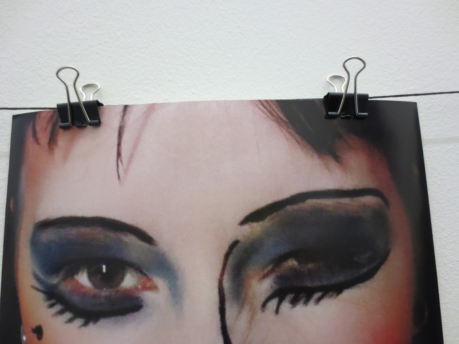
When it came to displaying my pencil stuff i was trying to steer away from just putting them in frames, i dont find frames that visually interesting and i cant be doing with paying for them either so i decided on having them clipped onto a wire or string in a neat little row. The string i used was from Paperchase which was a bit of a bugger to get tacked onto the actual wall, had to use drawing pins and a hammer so its not all that neat, my clips and my printouts are from Mailboxes etc. in Stirling done A4 size on semi glossy photo paper.

this was about as taught as i could get the string to go, it started to dip when the photos got pegged on but what can you do

i like these little clips id probably use this display method again but tidied up

Wednesday, 7 October 2015

Pencil Part 3 - Taking Photos

I got set up for taking my photos with an idea of how i wanted them to look, i was worried i was maybe overthinking the child portrait and trying to add to many bits so i started off with something basic, a childs drawing and writing on my face and then added some other stuff, like pencil shavings as i went so i didnt go overboard.

I set my camera up on the tripod in my room using natural daylight and used this matte black paper i had lying around as my background. I would have liked to use fancy lighting in a darkened room to look more like the professional illamasqua pics but didnt really have the time to wait for amazon shipping.


drawing on your face is much more tricky than drawing on your hand
i added these pencil shavings to my hair in later photos

inspiration for my face doodling, makeup by Andrew Gallimore
 Using better quality lighting might have meant i had less photoshop to use for these images, i basically made two copies of the photo layered in photoshop one darkened with the burn tool for my black background the other lightened with dodge for my skin, i put dark on top of light and used a really soft eraser to rub out the areas i wanted lightened. After this i used the dodge tool again on the writing on my face just to make it bolder looking . 

The next image was my adult, basically pretty, conformist makeup look. I decided to go for a 'red lips and liner' look since there are 211,000 videos that come up in youtube search it must be pretty popular with people wanting to do makeup proper. This was relatively easy to achieve, as i was taking the photos i quite liked all the romantic old portrait style poses i was making.


 This image was edited much the same way as the child but as well as using dodge and burn i used a layer with the colour vibrancy dialed up and used the eraser again to make my lips and eyes more stand out, again i used the dodge tool at the end to darken up the eyeliner and eyelashes and a bit of eyebrow.

The final image was my creative rule breaking makeup, i took a bit of inspiration from Val Garland and Alex Box and some clowny makeup they had done before. The idea was to be a bit ugly, androgynous and messy with colour placement.
Val Garland for Vivienne Westwood, really liked the black lines in this
Image from Rankins Surface Attraction

The makeup took a bit to put on and it took a while to get off as well, i really liked how it turned out though, i used these kind of unflattering 70s disco bright blue eyes and bright pink blush around the outside of my face, my hair was up with a peek of my undercut looking quite boyish and as a last minute decision i found this blue lipgloss in a little tube and just smeared it over my neck and chest. Just like before i used the dodge and burn layers to get pale skin and a darker background, used vibrancy to jack up the intensity of the colours and a bit of dodge on the black lines.


I actually decided for my final display to have a version of the images cropped closer but you'll see that next.

Tuesday, 6 October 2015

Pencil Part 2

Ive pretty much got a solid idea for my self portraits based on the pencil, im doing a child portrait which will include all the nostalgic things about the pencil, Here are some notes from my sketchbook:

'when i was a child the pencil was creative and uncertain and could be changed easily, there was no fear of making mistakes. I remember desks covered in rubber shavings and jaggy pencil sharpenings getting stuck in my tights.

as an adult pencils are the tools of my femininity, enhancing my features, smudges must be fixed, theyre used in a very precise way. I write in pen the majority of the time like i was taught to do after leaving primary school

Do pencils still hold the child-like joy and creativity for me as an adult?'

So the child portrait will have a little bit of nostalgia and some of the elements ive mentioned, maybe some childs drawings or face painting included.The next image would be the adult me conforming to beauty standards through makeup, ive done similar to this as part of the last project with instagram so im good with that. The last image will be the creative adult, so i get to be as crazy as i want and really expressive and excessive.

In the last post i mentioned Alex Box the creative director of beauty brand Illamasqua, i really love their promotional images and campaigns so im looking into their images as a bit of inspiration on how to photograph and edit makeup.

i like how soft and glowy this looks, by Alex Box

Illamasqua 'Throb' Valentines Campaign, makeup by Alex Box